Moonlight Bay · Visual identity
Identity Guidelines
A shared expression of our coastal setting, Mediterranean elegance, and tropical luxury.
Based on Version 1.0 · January 2025
Explore the guidelines ↓
01 / The foundation
Introduction
Consistent presentation builds recognition, trust, and a sense of community.
Our identity brings together Mediterranean elegance, a coastal location, lush tropical surroundings, a relaxing resort feel, and modern luxury. These guidelines define the brand mark, typography, colours, and secondary graphics, helping every expression of Moonlight Bay reflect the character and long-term vision of our community.
A cohesive identity supports property valuation, attracts buyers, enhances desirability, and strengthens resident satisfaction, while providing a framework for thoughtful creative expression.
02 / Our name
Naming convention
Use Moonlight Bay consistently in all external marketing communications. Reserve MLB for internal communication among team members and stakeholders.
External communication
Moonlight Bay
Internal communication only
MLB
Official website
03 / The brand signature
Logo
The segmental arch reflects Mediterranean architecture. Palm trees and a crescent moon evoke a tropical, coastal setting and a tranquil resort lifestyle. Shapes suggest mountain perspectives and coastal horizons.
The three stars (三星) draw on the Chinese tradition of Fu, Lu, and Shou, symbolising prosperity, status, and longevity. The crescent also acknowledges Malaysia’s Islamic cultural heritage.
A clean, modern logotype balances these classical symbols with contemporary sophistication. Always preserve the supplied relationship between the symbol and the name.
04 / Room to breathe
Clear zone
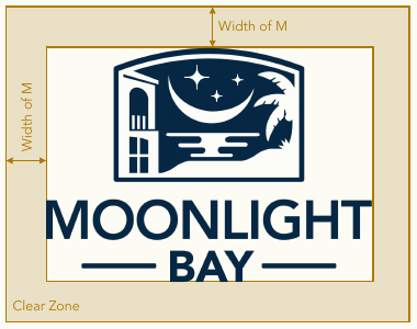
Keep clear space around the entire brand signature equal to at least the width of the letter M in the logotype, as shown. Keep text, graphics, and other elements outside this area so the signature remains visible and distinct.
05 / Single-colour applications
Black & white version
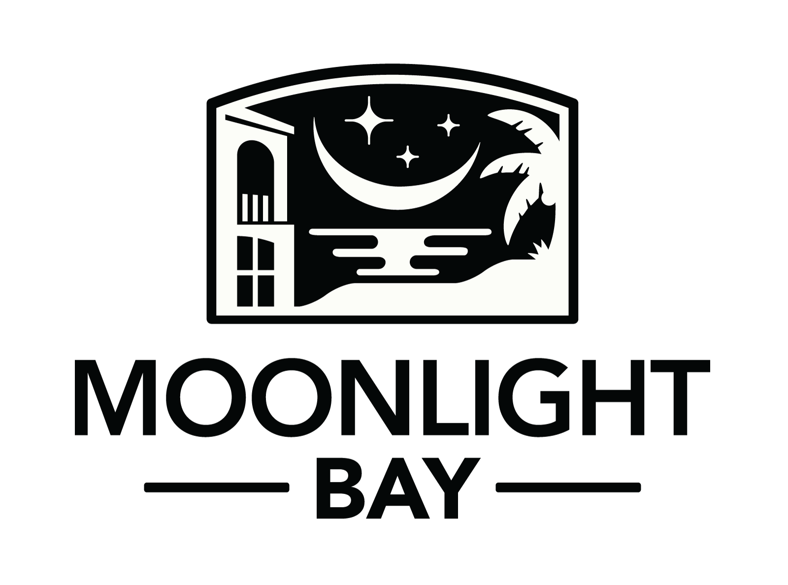
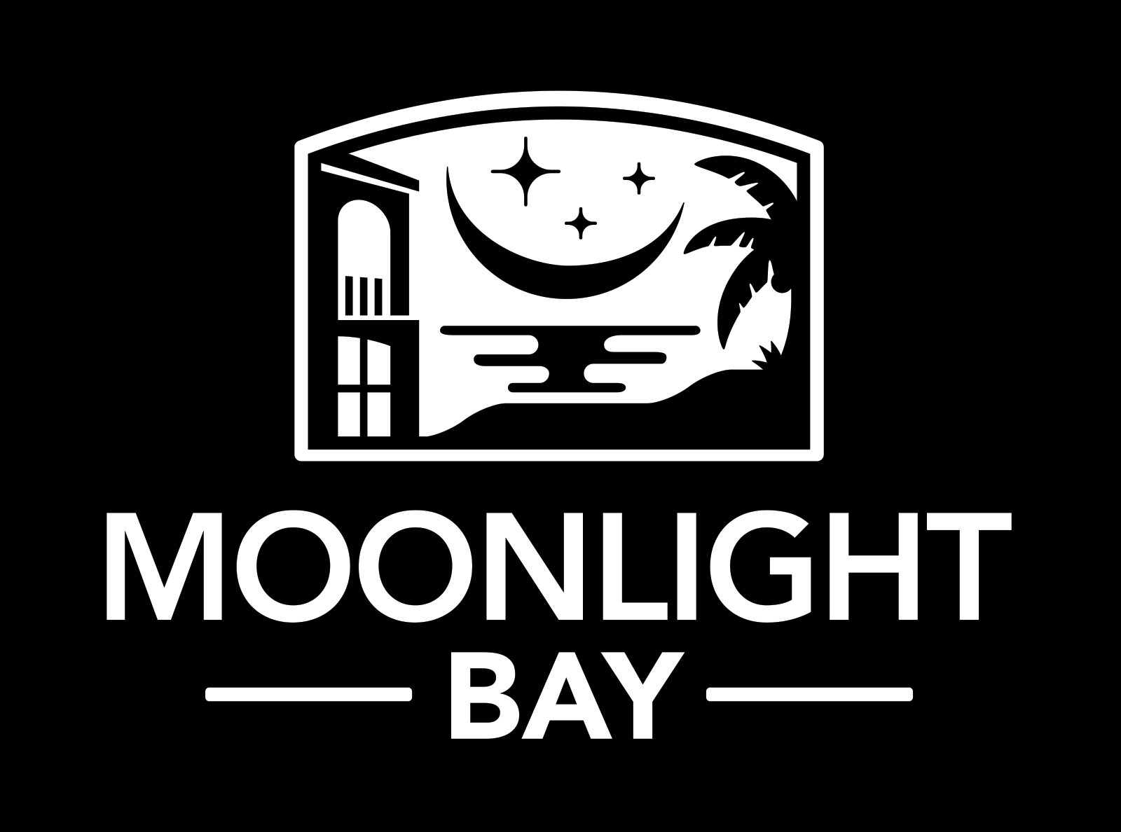
Use the supplied black and white versions for newspapers and other single-colour reproduction. Choose the version that provides clear contrast against the background.
06 / Protect the signature
Unacceptable usage
Reproduce the brand signature from the official digital masters. Do not alter its elements, add borders, introduce unapproved typefaces, or combine it with extra graphics.
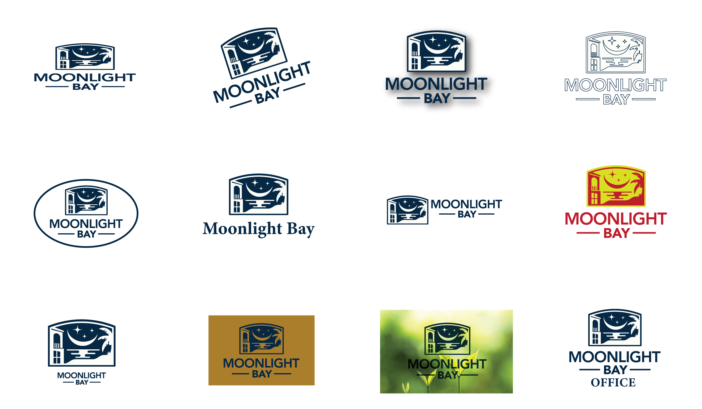
- Do not distort the logo.
- Do not place it on an angle.
- Do not add effects.
- Do not create outlines.
- Do not enclose it in a holding shape.
- Do not create a new logotype.
- Do not reposition or resize elements.
- Do not change colours.
- Do not change the proportions of elements.
- Do not use a low-contrast background.
- Do not use a busy background.
- Do not create department logos.
07 / Approved alternatives
Acceptable layout versions
Use the primary logo whenever possible. The following supplied alternatives are suitable when the format calls for them.

For short, wide branding areas, such as a pencil.

For very small branding areas where “Moonlight Bay” appears alongside the icon, such as social media profiles.
08 / Our palette
Colour palette
Clear Night, 24K Gold, and Active Coral are the signature colours. Tropical Beach and Moon Light provide neutral backgrounds that keep the core palette visually dominant.
Clear Night
#022542
24K Gold
#A67C00
Active Coral
#FF595D
Tropical Beach
#E7E0C9
Moon Light
#FCFCF6
Use these exact colour values for digital applications.
09 / Our voice in type
Typography
The original identity pairs Canela for headlines and titles with Avenir for body text. Avenir is also the specified choice for internal communications, including letters, memos, reports, and presentations.
On this website, Yeseva One replaces Canela, with Inter Tight for body text and interface elements. This pairing carries the same balance of expressive headings and clear, contemporary reading text into the web experience.
Headlines & titles · Website
Aa Bb Cc Dd Ee Ff Gg Hh Ii Jj Kk Ll Mm Nn Oo Pp Qq Rr Ss Tt Uu Vv Ww Xx Yy Zz
0123456789
Body & interface · Website
Aa Bb Cc Dd Ee Ff Gg Hh Ii Jj Kk Ll Mm Nn Oo Pp Qq Rr Ss Tt Uu Vv Ww Xx Yy Zz
0123456789
10 / Everyday communication
Stationery
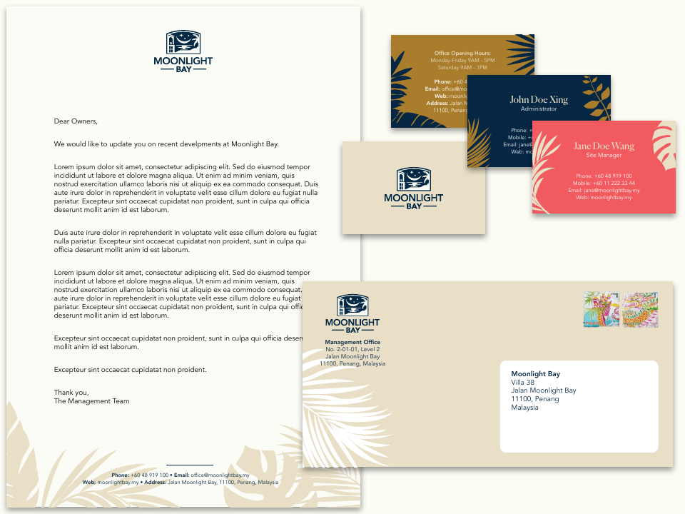
All stationery follows the approved colours, typography, symbols, and tropical plant background theme. Business cards have a standardised front and three approved colour variations for the back. Letterheads, envelopes, and other stationery use a single approved colour combination; black printing is permitted for official documents when needed.
Use professional, full-bleed printing. Home and office printers often leave unwanted white margins.
11 / Presentation materials
Folders & covers
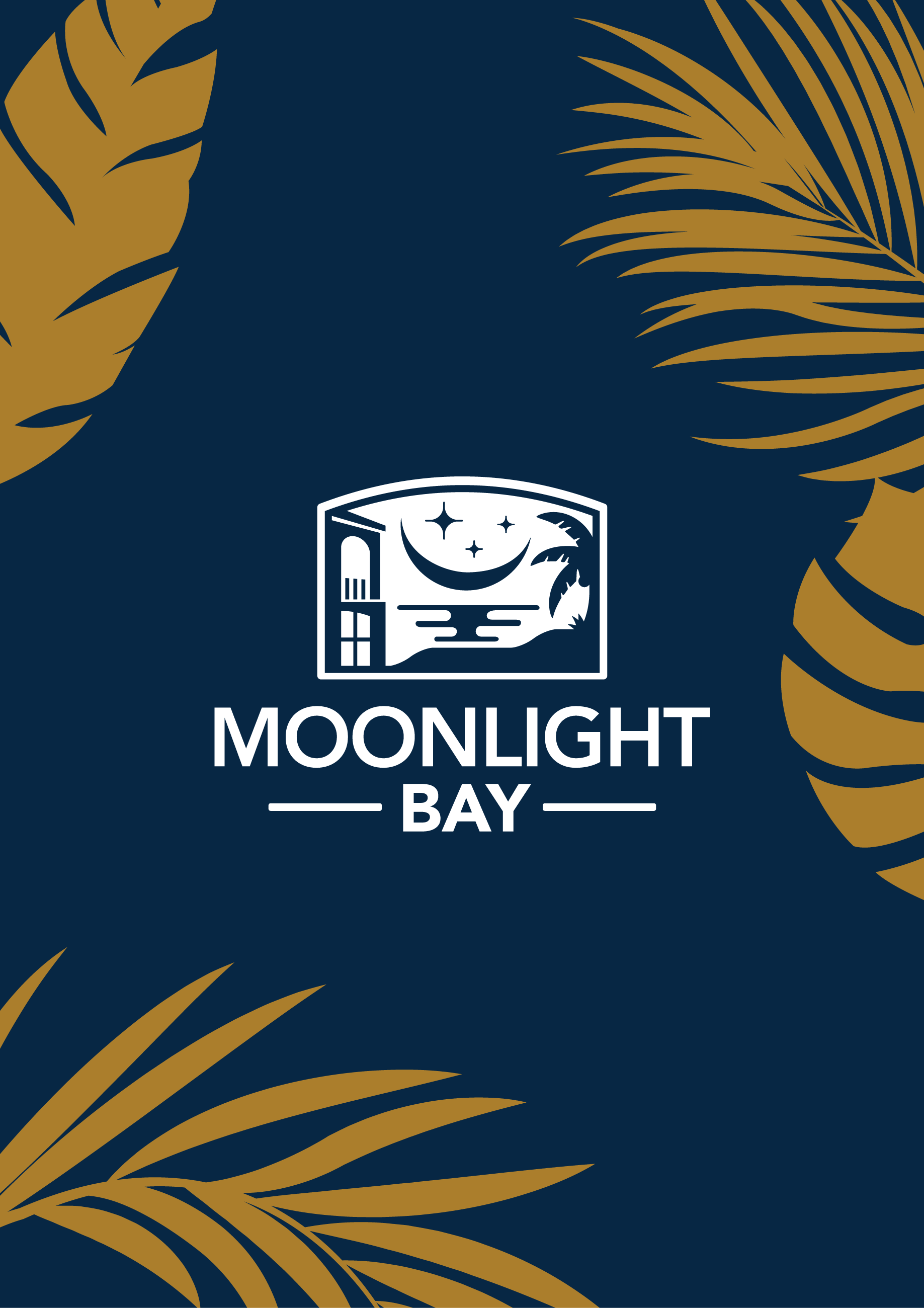
Carry the identity through to document folders and covers using the supplied tropical graphics and approved palette.
12 / Around the community
Signs and posters
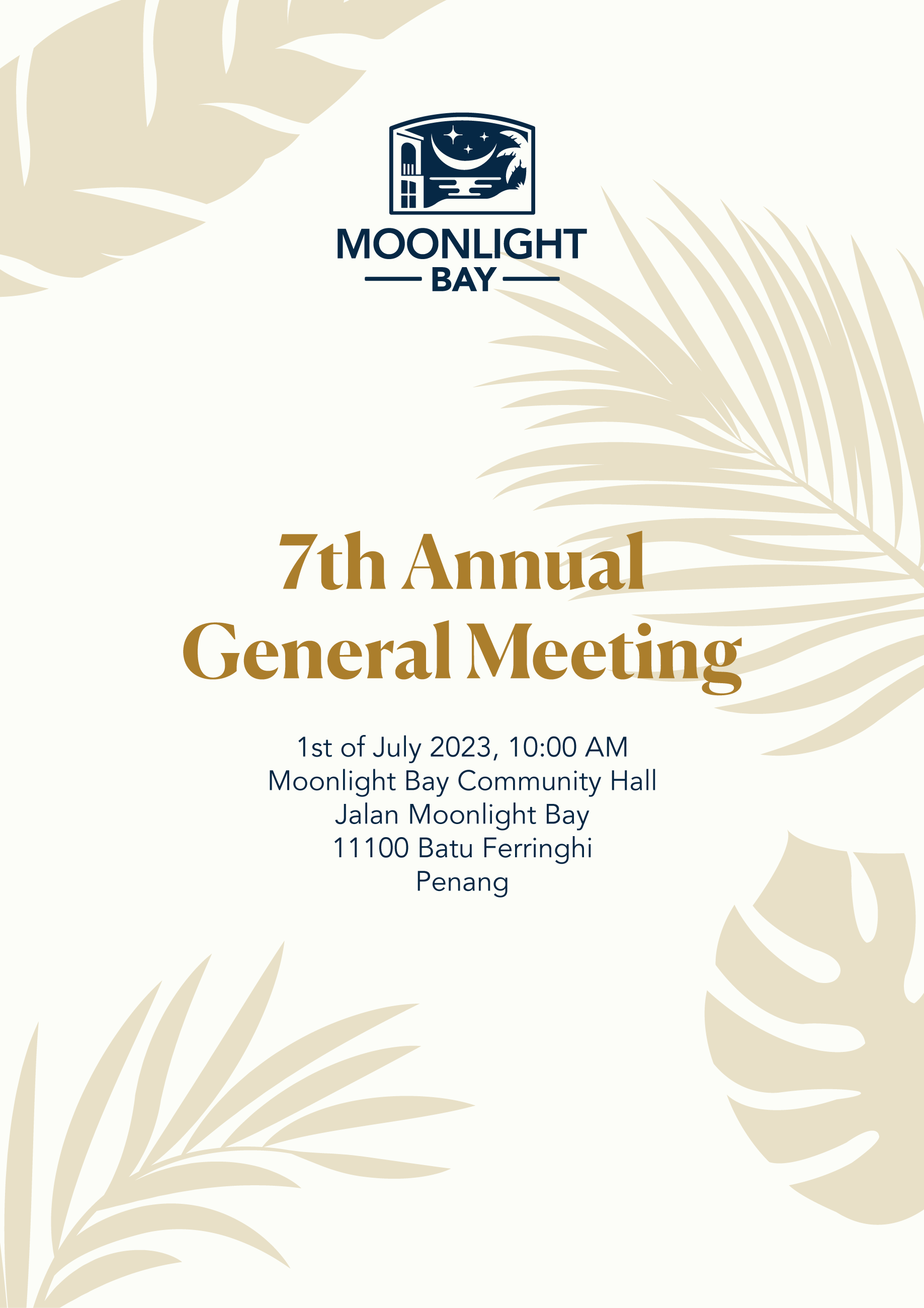
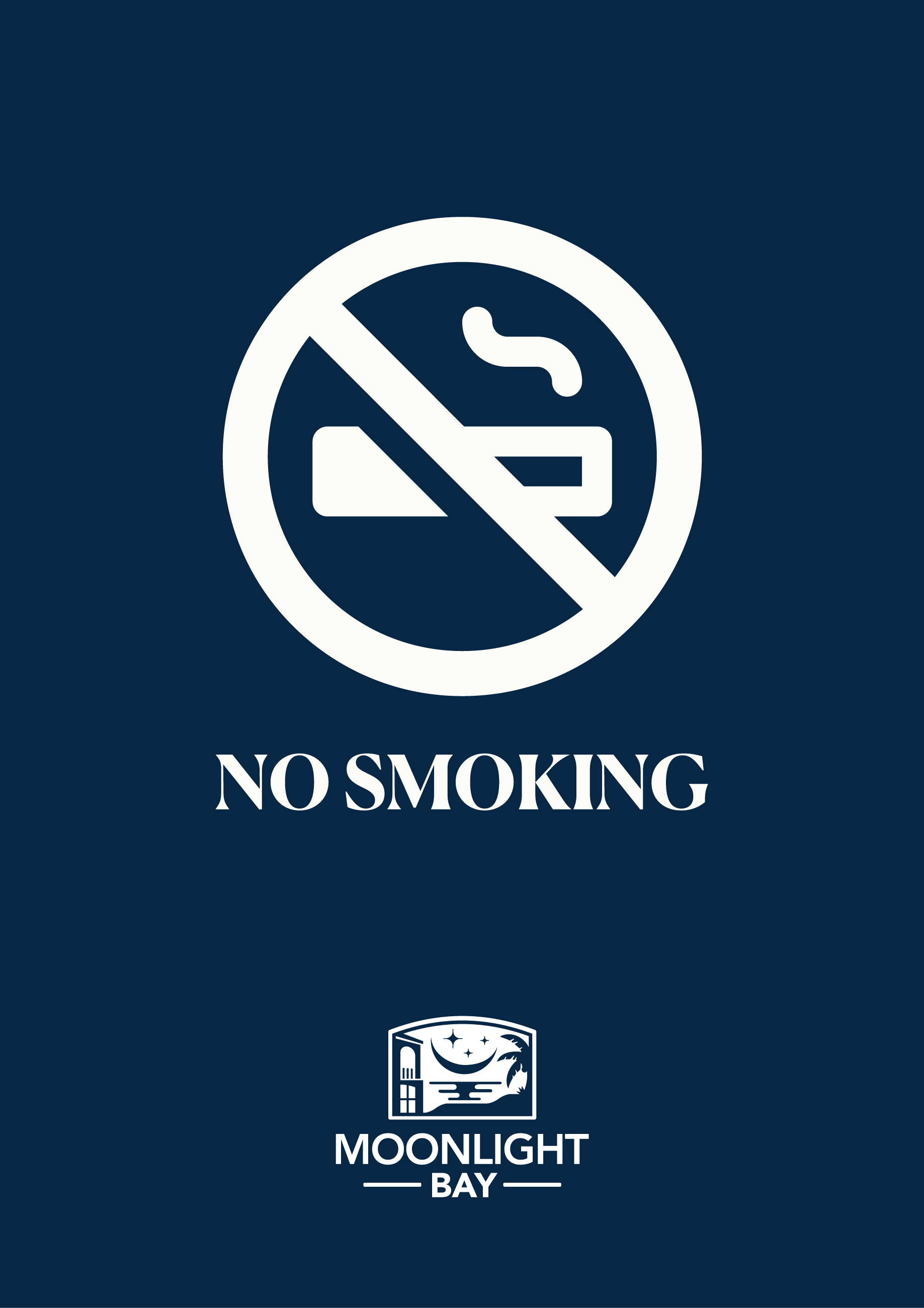
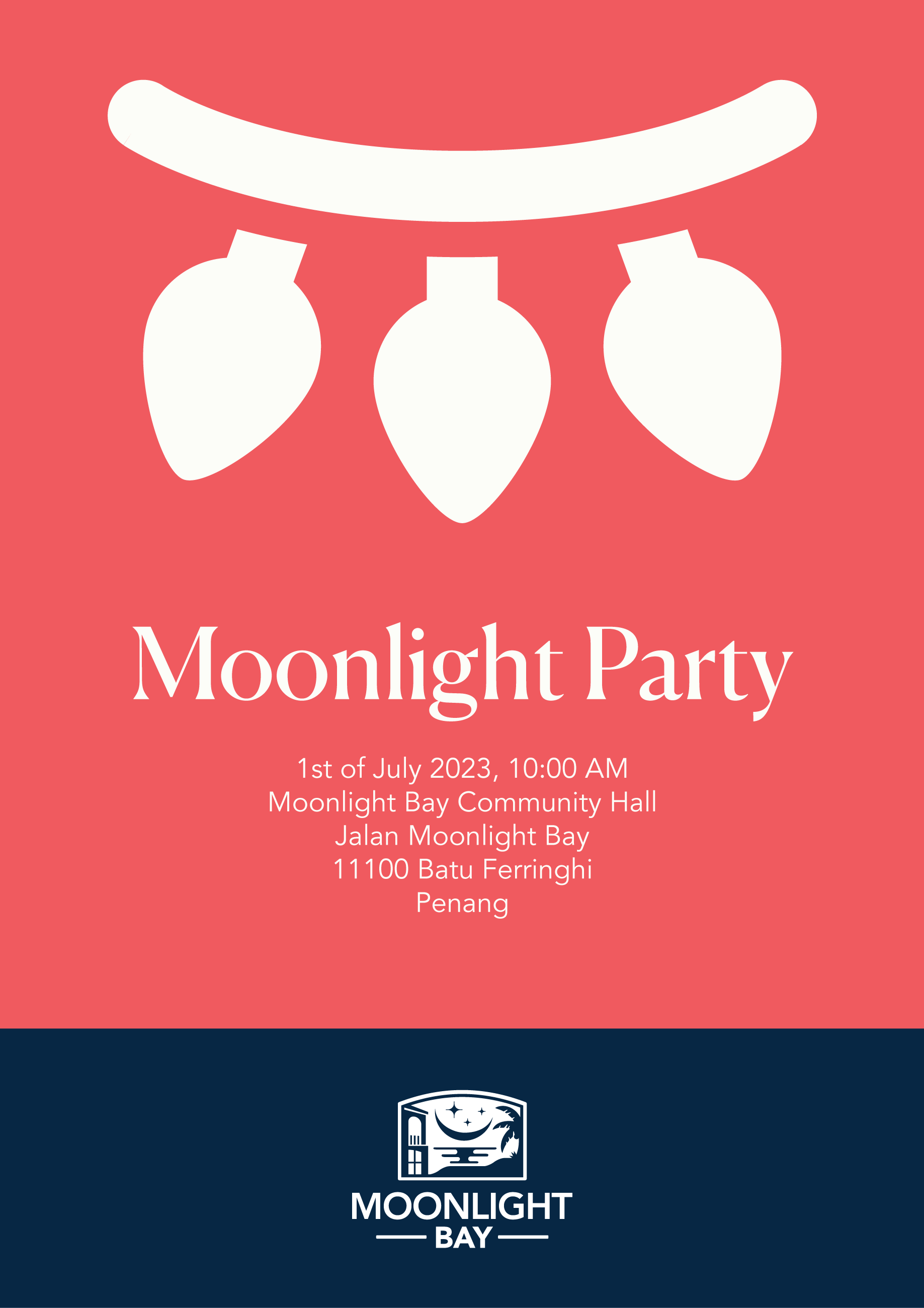
Apply the same colour, typography, and signature principles to signs, notices, and seasonal communication.

13 / The digital experience
Website
The website extends the identity into the digital space through a consistent logo, colour palette, and typography. Photography should communicate the coastal setting, resort lifestyle, and Mediterranean architecture.
Keep the design clean and sophisticated, with simple navigation and a responsive layout that works across desktop and mobile. Every detail should help residents, visitors, and potential buyers connect with our community.
Explore the Moonlight Bay website →14 / A sense of place
Photography
Select photography that feels aspirational and timeless, rooted in Moonlight Bay’s architecture and environment.
- Mediterranean architecture Elegant arches, warm-toned façades, and refined detailing.
- Coastal location Sweeping ocean views, golden sunsets, and serene beachfront scenes.
- Tropical environment Lush greenery, swaying palms, and vibrant flora.
- Resort lifestyle Tranquil moments, inviting outdoor spaces, and a relaxed pace.
- Modern luxury Sophisticated interiors, premium amenities, and carefully curated details.
Moonlight Bay · Identity Guidelines
Back to top ↑